BRAND IDENTITY | WEBSITE & APP DESIGN | BRAND COLLATERAL | ADVERTISING
Vicino’s Pizzeria
The development of this brand identity project revolved around understanding the brand and their core values, the clients, and how to maximize the connection between the two. Vicino’s Pizzeria is a family-run business which cares deeply about their community and is passionate about serving authentic Neapolitan food made with the highest of quality ingredients. My directive as a designer was to assist in their goal of branching out from a small, local hideaway, to establishing a stronger identity by building a relationship with a larger audience.
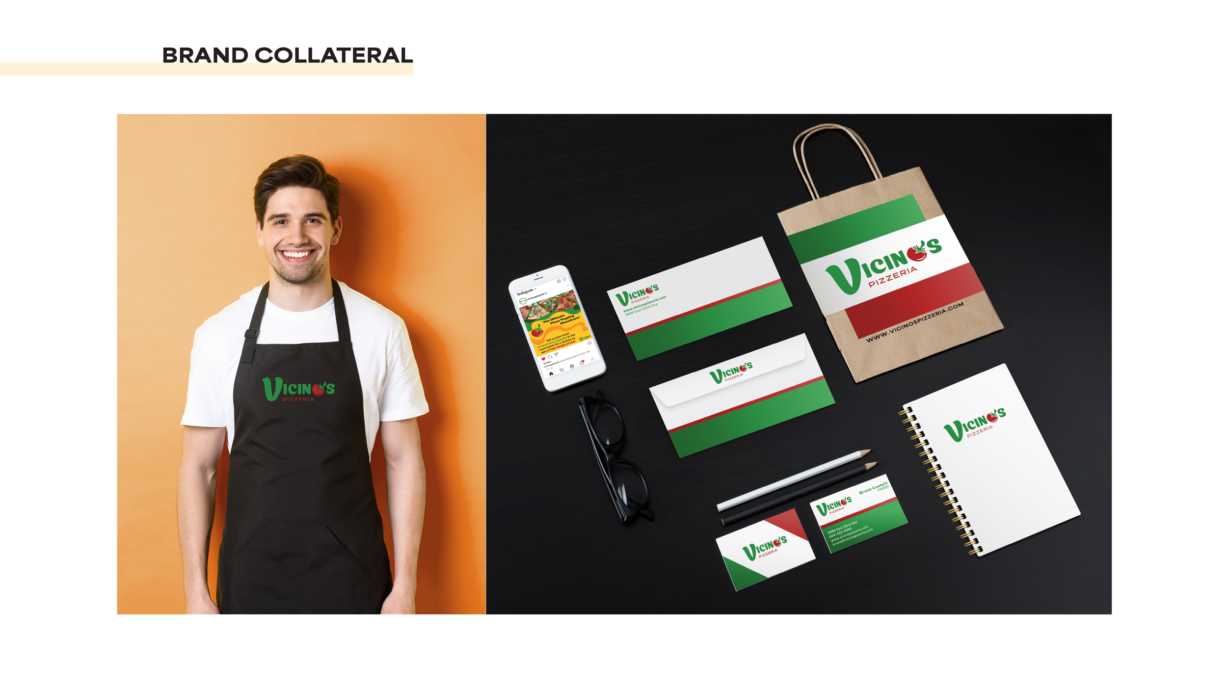
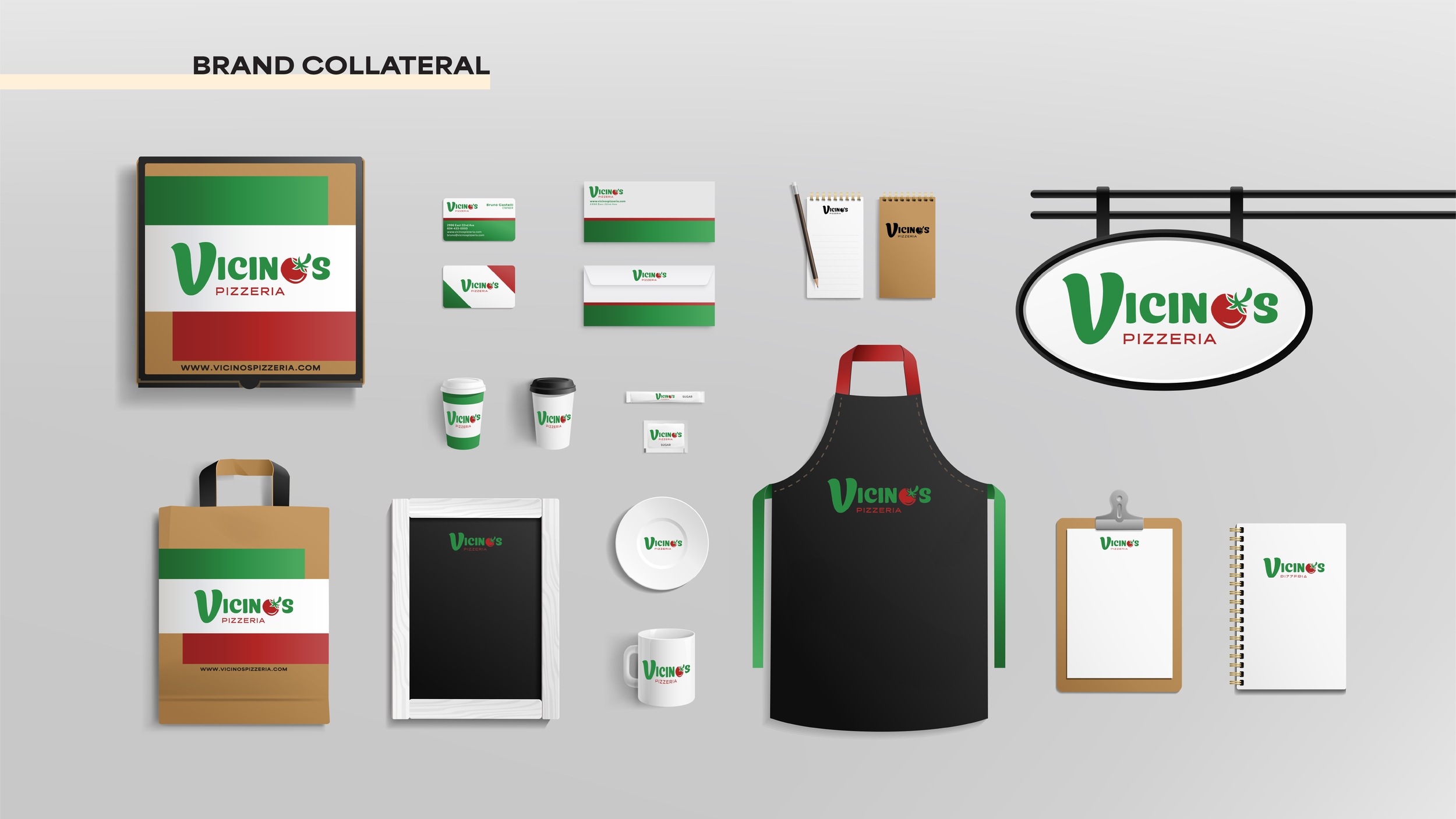
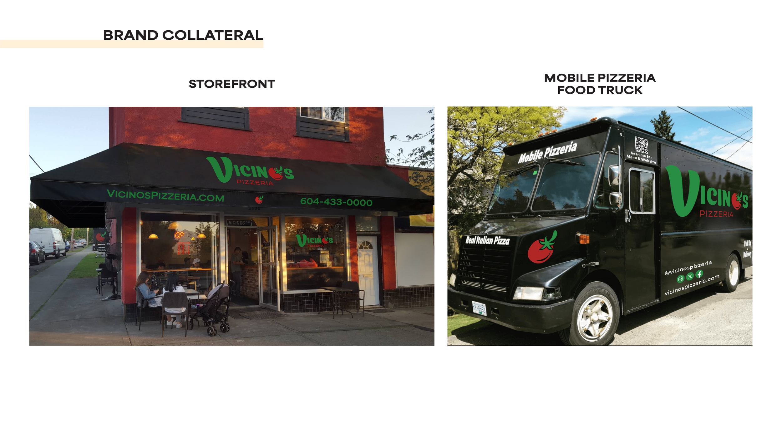
The result was a modernized brand with a broader reach and a bold yet friendly visual identity. By building on Vicino’s warm, inviting charm, this makes sure that every customer feel like family. I created a brand guideline along with additional brand collateral, advertisements, and high-fidelity website and app prototypes.
Programs Used:
Adobe Illustrator
Adobe InDesign
Adobe Photoshop
Figma
Student Project:
2025
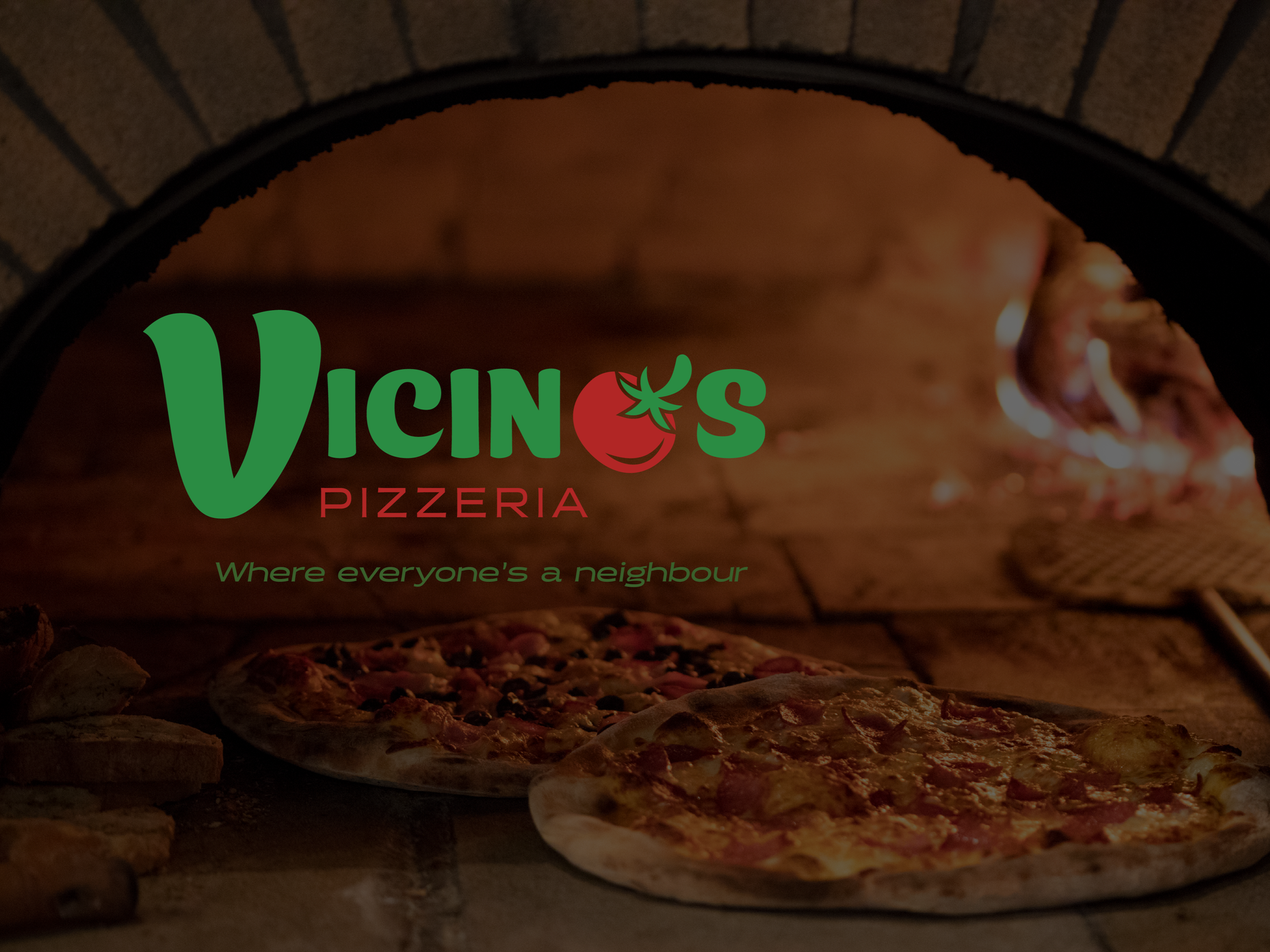
Logo Variations
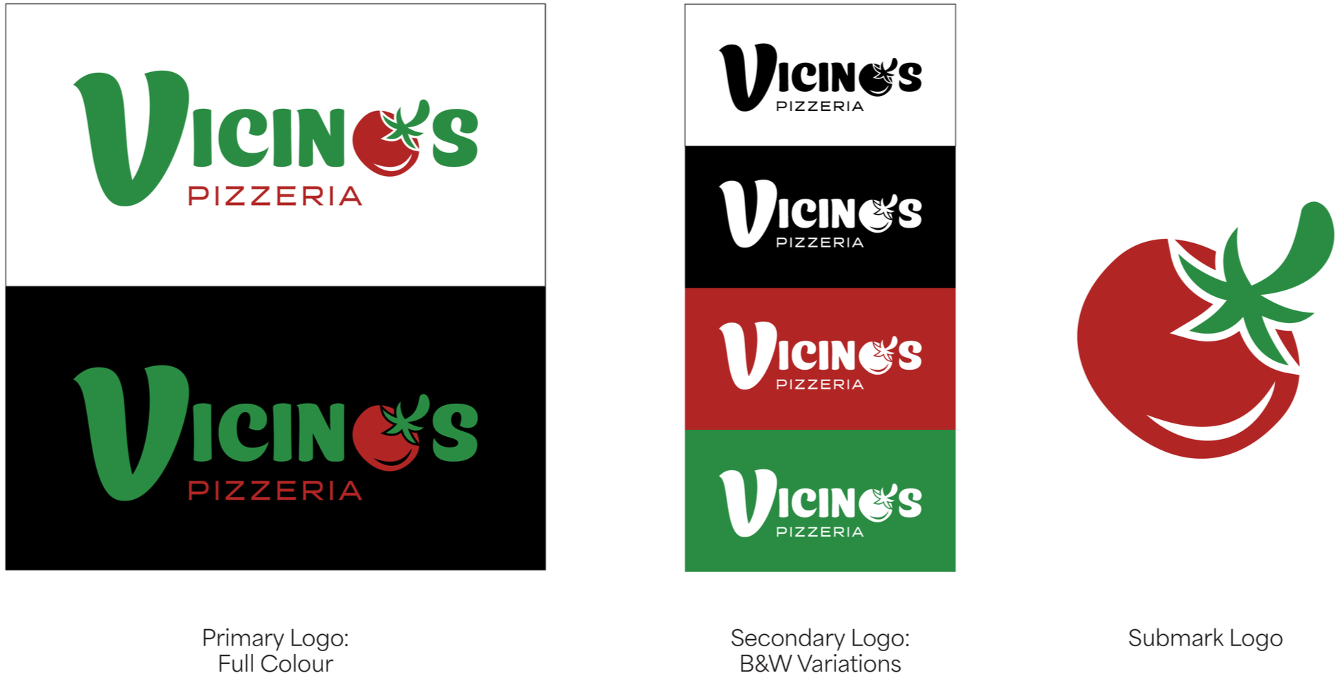
Combination Mark Logo
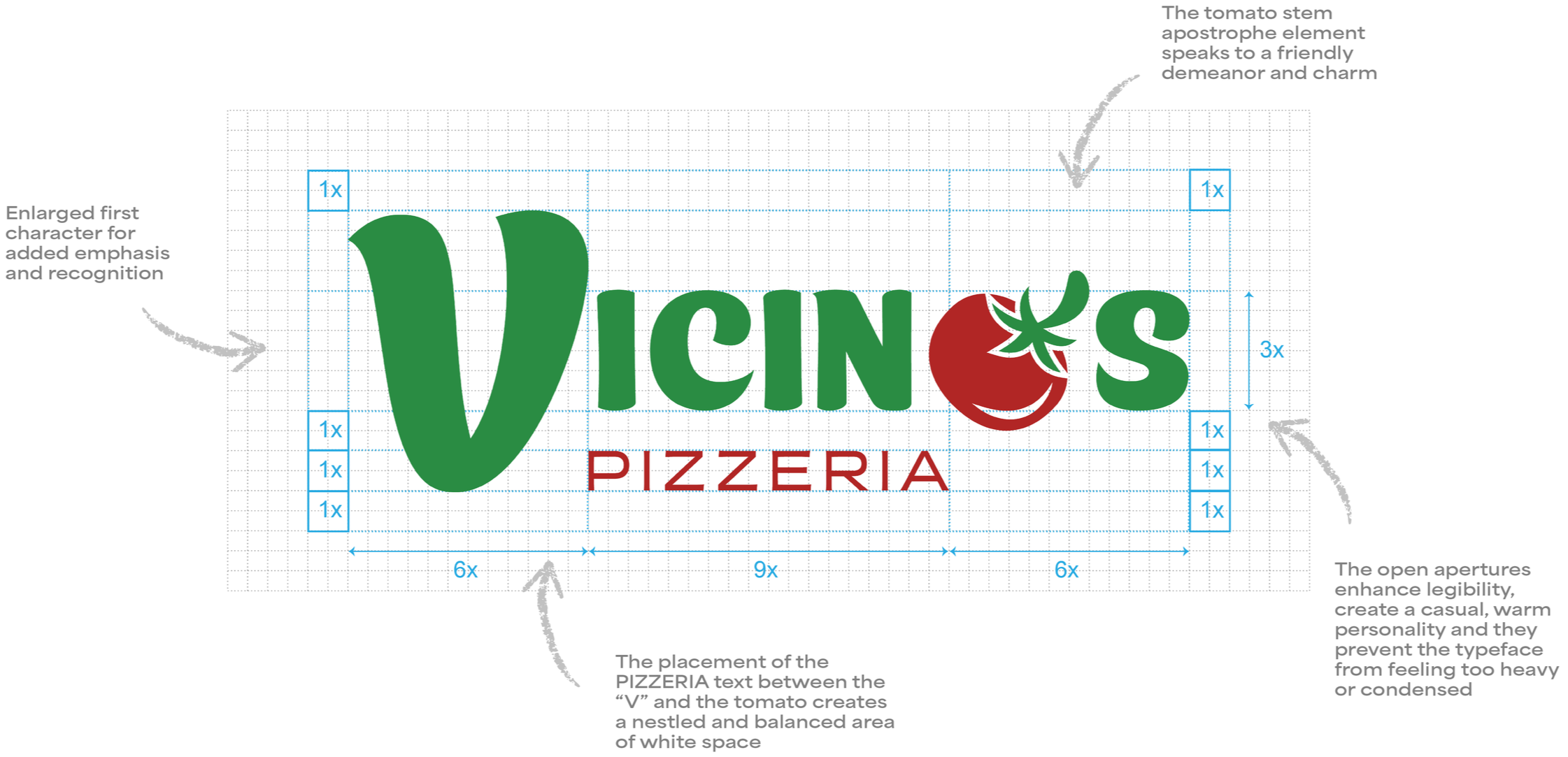
Logo Design Rationale
Brand Tone Keywords:
Friendly
Community
Homemade
Comfort
Warm
Fresh
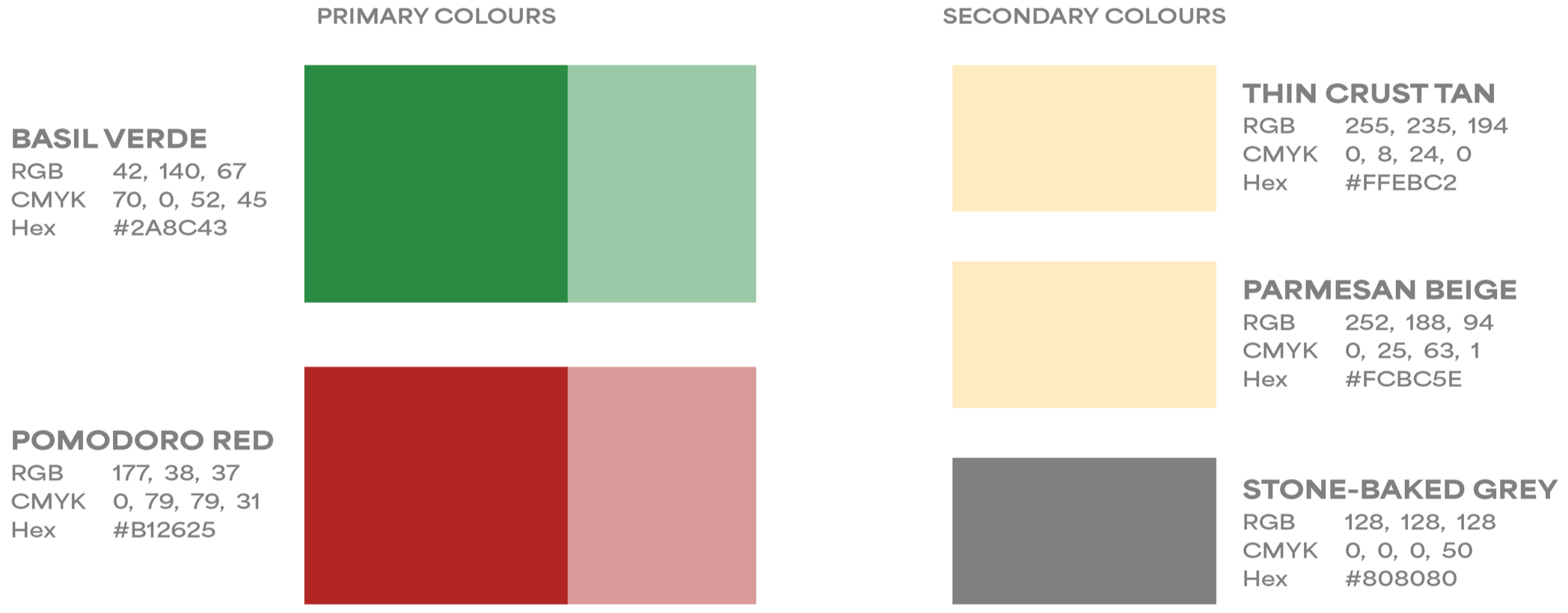
Colour Palette
The inspiration for this colour palette is to communicate a sense of vibrant energy while still remaining approachable and welcoming. Paying homage to the colours of fresh, quality ingredients you would see used at Vicino’s, this warm blend of colours is meant to remind you of deliciously nourishing meals shared with family and friends.
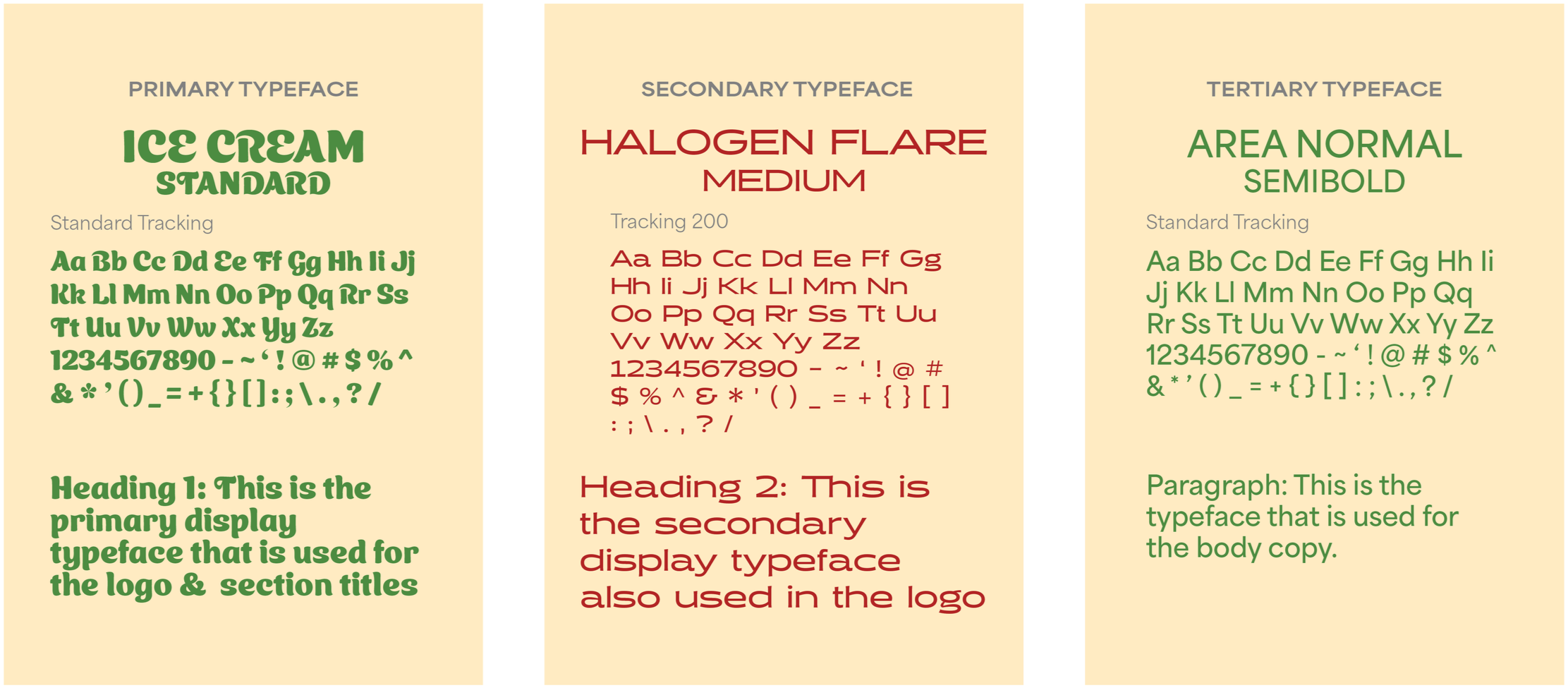
Typography
The Primary Typeface, Ice Cream Standard, is fabulously bold and full of curves which adds an energetic affability to the brand. Playful, vibrant and memorable - echoing Vicino’s personality.
The Secondary Typeface, Halogen Flare, has a unique and high-contrast visual impact, with more character than a standard geometric aesthetic. Thoughtfully curated forms create a sculpted elegance while still commanding attention.
The Tertiary Typeface, Area Normal, is modern and precise, with a grounded minimalist style to balance with the previous maximalist typefaces. The clean lines and open letterforms provide a distinct contemporary look with a structured yet approachable design - ideal for the brand’s digital media and print.
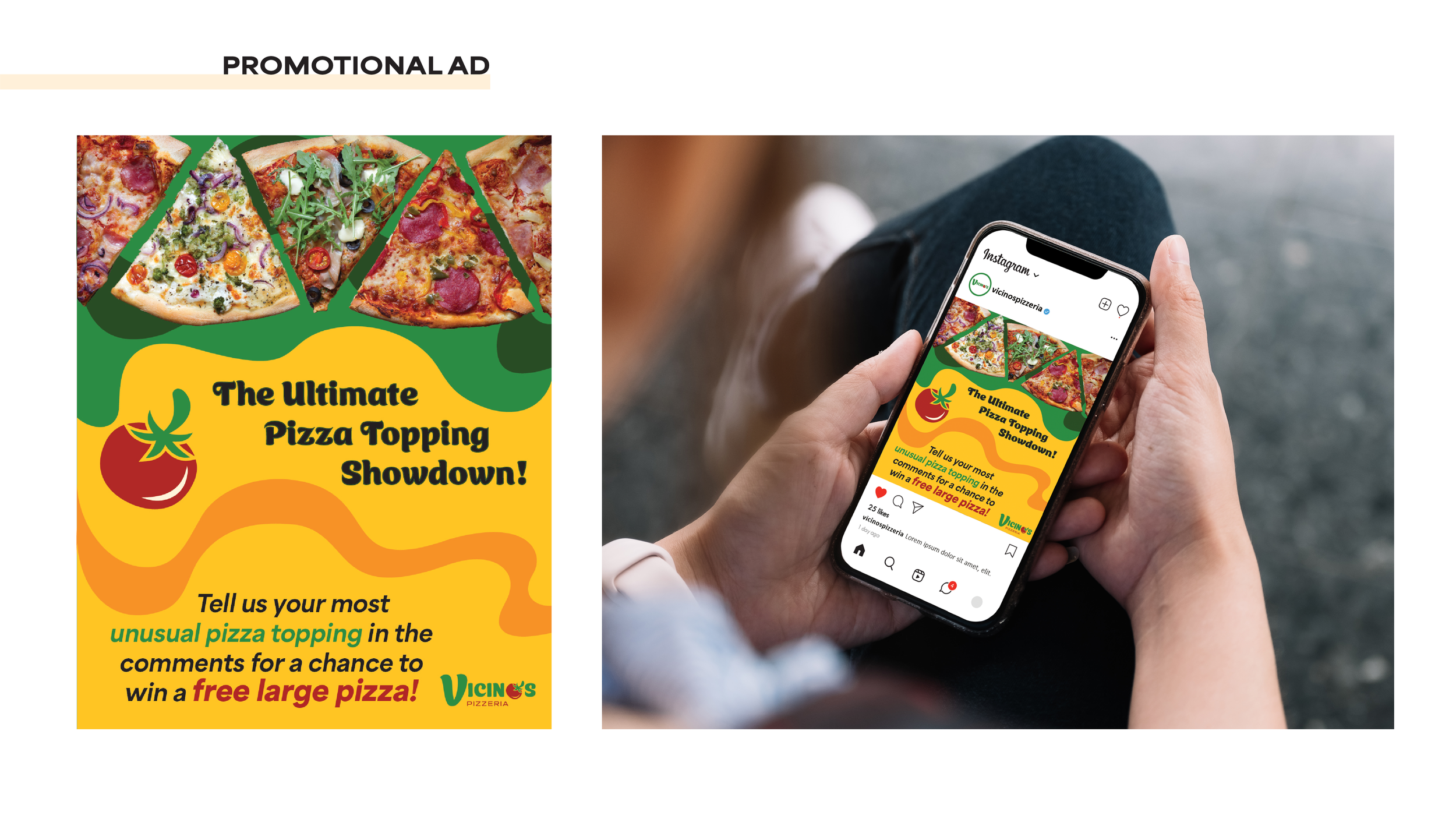
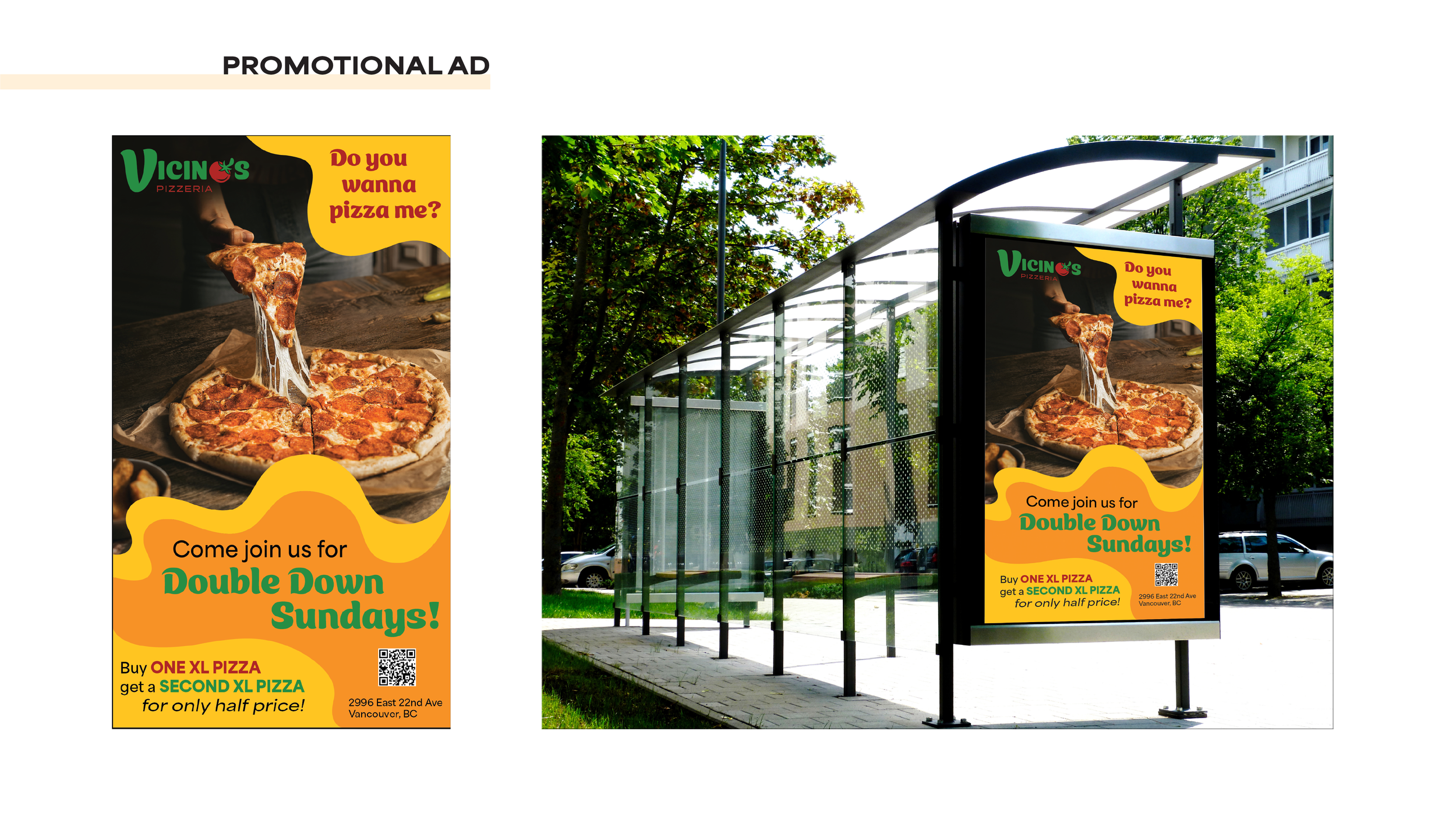
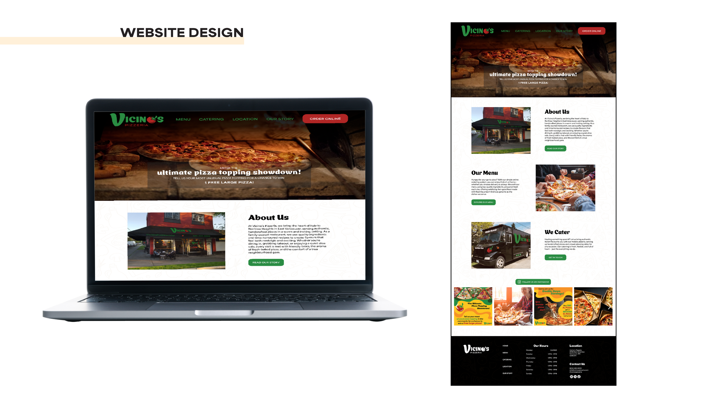
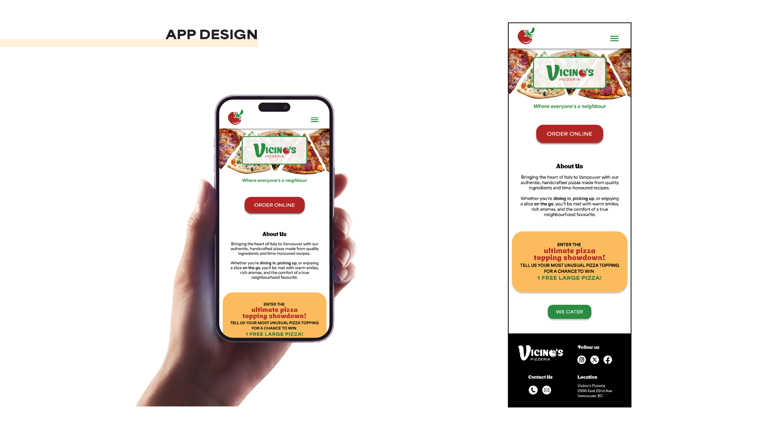
Merchandise, Advertising, Website & App Design